http://prezi.com/c_s7iremvgm8/media-magazine-evaluation/
This is a link to the Prezi presentation that i created.
Tuesday 3 May 2011
Monday 2 May 2011

Double Page Spread

This is my design of a double page spread that i designed. Click on the image so you can fully see the article.

Sunday 27 February 2011
Deyes High Newsletter Analysis

This is the Deyes High School Newsletter. It is not very attractive because it is plain, simple and bold. There are no colours used on this except for black and writing which is used on the text also. “Deyes” is shown in large bold writing so it is easy to see what you are looking for. The image is no Photoshop or anything like that, it is just a bit of shading on it which it makes the school look like an old fashioned and not modern at all.
I think that in the newsletter they should include a lot more colour and take some pictures from inside the school grounds so you can get a good feeling of what the school is like inside. The newsletter is quite messy and scruffy to be honest, it only has three fonts used and by looking at it, it’s not taking very long to develop and make, it makes it look like someone has either rushed through making it or doesn’t know what they are doing. There is nowhere near enough text used on the page, there should be a lot more include showing a lot more about the school onto it. I think that colours such as red, white, black and even blue would suit going with this newsletter very much and editing/ looking through all of the different types of fonts and finding a very attractive one.
Magazine Content Page 2 Analysis

This is my second analysis of a content page from Kerrang magazine. I analysed such things as images used inside, the text and font that has been included, and layout and ways it attracts the audience.
Double Page Spread 2 Analysis

This is my second analysis of a double page spread, this time I used NME magazine of what I analysed. The things I analysis are about the images chosen, the colours used and the attractions of which may vary.
Thursday 24 February 2011

Content Page Analysis

Front Cover Analysis

This is a front cover I analysised, I noticed about the colours having the effect of clashing In with the picture in a good way. I also thought the masthead of kerrang magazine is brilliantly attractive and eye catching so it does bring the readers in, with the whole cracked and broken text. Quotes being used for out bringing attention and does bring it in a lot because people may adore the band that are on the front over and they see a quote from the lead singer saying something important, they want to know about it straight away.
Sunday 20 February 2011
Kerrang Front Cover Analysis

This is my analysis of a Kerrang front cover. In includes such things as colours, headings etc. the text is a bit small on the print, click on the image and it will take you to a window with an expanded image.
Mood Board 2

This is the second mood board I have completed, this one shows the album covers and different styles they are. It is all still the same genre of music used.
Mood Board 1

This is one of two mood boards that I have created to show my different type of music but is still based along the same genre. I have different varieties such as metal/acoustic/alternative/ pop punk/ Screamo. These are all based in magazines such as Kerrang, NME and Q etc.
Content Page Mockup

This is the mock-up of my sixth form magazine contents page. This includes a large picture to show the main head attraction of the magazine issue. On the right hand side is the content list which tells you what is on each and every page of the magazine. There is also a puff at the bottom to show either an offer or a special surprise happening. I have also including the Deyes High logo onto my page.
Sixth Form Magazine Final Outcome

This is my final outcome for my Sixth Form magazine. This is related to the template I made on a previous blog. All the objects as such are in the same position. My magazine is called “Deyes Weekly” this will instantly attract a reader to getting a hold of it because they will want to know what is going on around the school/sixth form. The banner I have runs along the right hand side of the page which tells us what the magazine is about technically. The main image I used is related straight to the headline. There is 1 puff used on the design and is very attractive because it says “Half Price Food” I have used bright blue as the main background colour for the design because it stands out and is very attractive to see. I also used a barcode at the bottom left hand corner, I used this just to show that the magazine looks professional and not a blag.
Analysis Of Same Genre Music Magazine.

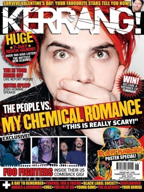
In this blog entry, I am showing the same ideas in the same genre of music magazine. Above I have uploaded two Kerrang magazine front covers which includes; My Chemical Romance and Bring Me The Horizon. The genre of music associated in these front covers is Rock. I will identify the things that are the same about both covers. The same thing about both is the heading which is a broken title, this shows the tough and fierceness of the music, it also resembles the loudness and anger. The colours are both similar on both pictures, there is black, red and white; these are the main colours that are used in the Kerrang franchise. The contrast is very good between the colours as they go with the pictures because the main picture with the band on, they usually dress in darkened colours so this allows them to fade into the colours. The layout of the images is the same for the magazine covers, there are no real spaces because everything is basically packed together. The sorting out of objects on the page are not exactly well thought out, the creators have basically just lobbed them all on the page not bothering which position they are, I think this gives a great effect consuming of the music that the magazine is about.
Ideology
Ideology is a study of ideas. It tends to refer in different ways people think about the world and their own way of how they live in this world. This is a little bit different from philosophy because ideology encompasses the concept of ideals are the best way.
Charter Of Values.
Deyes Lane Charter Of Values
Commitment
Kindness
Forgiving Attitude
Value & Respect All People
Trust
Responsible For Your Own Actions
Fairness
Respect Other Peoples Property
Co-Operation
Honesty
Enthusiasm
Semiotics
Semiotics is the general science of signs. The meaning of semiotic is the study of conceived signs as a science or discipline theory or doctrine. Expressions and contents, forms are also studied aswell.
Connotation - What this might suggest
Denotation – What you can see
Denotation – What you can see

Narcissistic Identification

This is an image of Kerrang magazine, the front cover is shown with a picture of a band called You Me At Six. Narcissistic identification shows its demand of its identification to the source on the magazine which is shown to fascinate the spectator to recognise their likenesses.
Terminology
Buzz Words: "Wow", "Exclusive", "Free" are all examples of this.
Puffs: Colourful boxes promoting features inside.
House Style: A magazine's distinctive design that distinguishes it from its competitors.
Strap Line: A slogan
Banner: Text which stands out on a coloured background generally at the bottom of the magazine.
Copy: The Main Story in the Magazine
Anchorage Text: The way in which text helps to pin down the meaning of a picture and vice versa.
Pugs: Placed at the top left and right corners of the paper and are known as the 'ears' of the page. The price of the paper, the logo or a promotion are often positioned there.
Motto: Memorable phrase that is recognisable to a brand
Headline: Catchy Title for the main article
Sell Lines: Text on the front cover that helps to sell the magazine to the audience
Caption: Description of the main image
Masthead: Name of the magazine
Lead: The introductory paragraph of an article. Usually written in bold or capitals.
Drop Capitals: Really big letter that starts off an article
Male Gaze

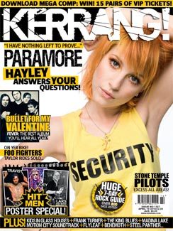
There are two photographs on the front covers of the magazines, Kerrang and Spin which they both include Paramore lead singer Hayley Williams. This is to show the male gaze Fetishistically and voyeuristically. Having an attractive lead singer posing in different positions usually attracts males to buy the magazine just for the inside look at the girl.
Music Magazine Questionnaire
https://spreadsheets.google.com/viewform?formkey=dGdCUHpxVk55eG5zNWFUNDVFcW41MVE6MQ
this is the link to my questionnaire for a music magazine.
this is the link to my questionnaire for a music magazine.
My chosen genre

This is an image of pop punk band lead singer “Josh Franceschi” I uploaded a picture to show my chosen genre for my music magazine. My chosen genre is Pop Punk/Alternative, this type of music can interfere with any type including; Indie/Screamo/Metal/Acoustic etc. This type of music consumes such things as guitars, drums, bass etc. I will be showing these in my music magazine.
My First Media Blog Posted
Hello and welcome to my AS level Media Blog.
On this i will be updating my work and making sure i keep track on the work that i do. On my blog i will be including a different number of analysis which include things such as music magazine front covers, content page and double page spreads and all of these will have 2 different analysis’s . I will be then doing another analysis which will be of a front cover which then I will be creating a mock draft of a college magazine front cover. I will be also creating a content page for the magazine. For the organisation of the magazine I will be creating mood boards so I will be able to design my page. I will be marketing and producing my magazine for the young teenage audience of society nowadays.
Thank you for visiting my blogger.
Subscribe to:
Posts (Atom)